Entertainment

What’s Really Causing Those Stubborn Orange Towel Stains?

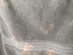
I’ll never forget the morning I first noticed it. I had just pulled a gray towel from the stack in my linen closet, one I had used countless times without issue.

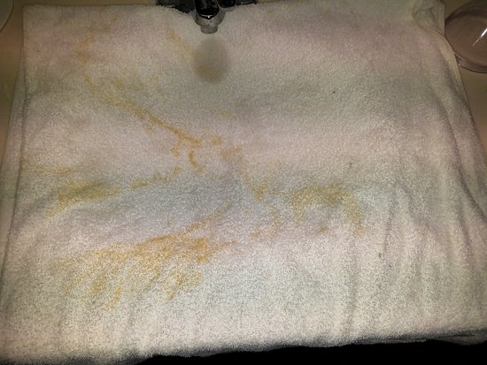
And then, there it was: a bright, almost neon orange blotch glaring up at me from the fabric. The color was so vivid, so unnatural, that for a moment I questioned whether my eyes were playing tricks on me.

It was as if someone had carelessly swiped the towel with a fluorescent marker, leaving a glaring imperfection in the middle of what had always been a soft, comforting piece of fabric.

At first, I assumed it was a spill or perhaps a rust stain from the old metal towel rack in my bathroom. These things happen occasionally, after all, and I wasn’t too concerned.

I brushed off the blotch mentally, telling myself it was a one-time occurrence that would surely disappear in the wash.

With that in mind, I tossed the towel into the washing machine, adding an extra dose of detergent and even a bit of stain remover, fully expecting the offending mark to vanish.

But when the cycle ended and I pulled the towel out, the orange blotch remained stubbornly intact — bright, bold, and completely unyielding. That was the moment I realized that this wasn’t going to be a minor problem. This was something far more perplexing.

In the weeks that followed, the orange blotches began to spread. Towels that I rarely used suddenly exhibited the same vivid, unnatural stains.

Pillowcases, hand towels, and even a few of my favorite shirts weren’t spared. At first, the spread was subtle — a few flecks here and there — but over time, it seemed as if my laundry room had been sprinkled with orange confetti, random blotches that didn’t make any sense.

I couldn’t understand why this was happening. I washed the items carefully, used multiple cycles with strong detergents, and even tried specialized stain removers, yet nothing made a difference.

Determined to solve the mystery, I turned to research. I scoured forums and blogs, spoke to friends, and read every article I could find on fabric discoloration.

That’s when I began to discover the surprising truth behind these marks. The first major revelation was that the orange blotches weren’t stains in the traditional sense.

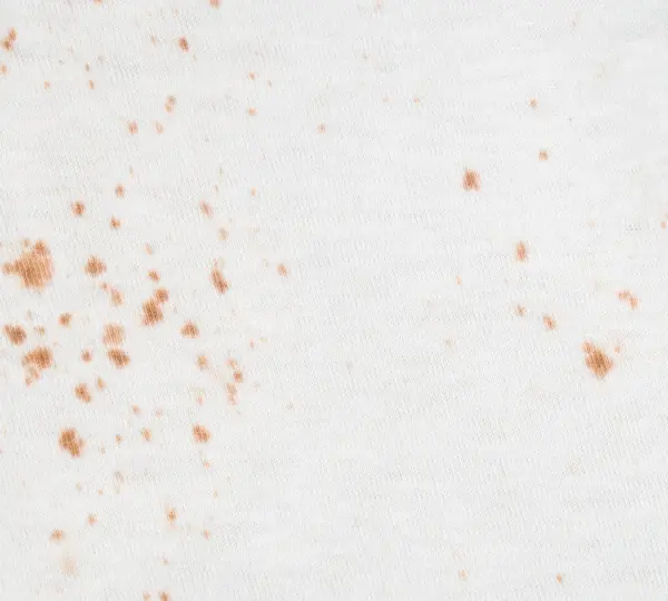
They weren’t caused by food, rust, or an external spill. Instead, the primary culprit in many cases was a chemical called benzoyl peroxide — a powerful ingredient found in many over-the-counter and prescription acne treatments.

Benzoyl peroxide doesn’t add color to fabric in the way a marker or spilled juice would. Instead, it acts as a bleaching agent, breaking down the dye in fabric fibers and leaving behind permanent orange or yellowish patches.

In other words, rather than depositing color, it strips it away, leaving a vivid discoloration that can’t be washed out. This explained why no amount of detergent or stain remover had worked on my towels: I wasn’t dealing with a traditional stain at all. I had been witnessing chemical bleaching in action.

With this knowledge in hand, I became much more careful about how I used skincare products containing benzoyl peroxide.

I started designating specific towels solely for skincare use and switched to white towels for that purpose. Using white towels meant that any bleaching caused by the chemical wouldn’t be noticeable — the orange or yellowish patches would blend in, making it a practical solution for managing the problem.

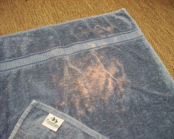
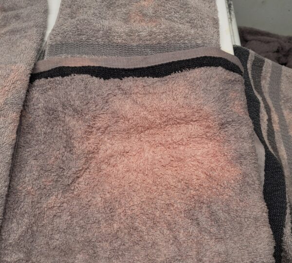
Yet benzoyl peroxide wasn’t the only culprit. My research also uncovered high iron content in household water as a major source of orange discoloration on fabrics.

For homes with well water or older plumbing systems that use iron pipes, the mineral can leave reddish-orange deposits on laundry over time.

Unlike the large, uneven patches caused by benzoyl peroxide, these iron stains tend to appear as smaller, scattered dots and often worsen with repeated washing. Over time, these mineral deposits create the same sense of frustration I felt with my towels and linens.

Certain hair care products, self-tanners, and even some tinted shampoos also contributed to the problem. These products contain pigments that transfer to fabric during use.

While the color may be invisible on wet fabric, it becomes more prominent once the fabric dries, appearing as faint blotches or streaks that mimic the look of staining. Additionally, some cleaning sprays, bathroom cleaners, and other household products contain hidden bleaching agents or peroxide compounds.

These can leave behind discoloration long after use, creating a confusing trail of “phantom stains” that are difficult to trace back to their source.

Armed with this knowledge, I experimented with preventive measures to stop the orange blotches from appearing in the first place.

One of the simplest yet most effective changes I made was to separate towels and linens used with chemical-based skincare products. I began reserving older or white towels for these tasks, ensuring that any bleaching would be less noticeable.

Additionally, I developed the habit of allowing all skincare products to fully dry before coming into contact with fabrics. This reduced the likelihood of accidental transfer.

For hair treatments and other personal care products likely to leave pigment on fabric, I switched to using older towels I no longer minded ruining.

Over time, these small adjustments drastically reduced the frequency of new discoloration, giving me more control over my linens and towels.

Another important change was installing a water filtration system designed to reduce iron content. The difference was immediate and dramatic.

Rust-like orange spots became far less frequent, and the fabrics that had previously suffered from mineral deposits looked fresher and lasted longer.

It was a reminder of how often the smallest environmental factors — like minerals in water — can have an outsized impact on everyday life.

As I gained experience, I also learned to read the orange marks to identify their likely source. Large, irregular patches of bright orange or yellow generally indicated bleaching from benzoyl peroxide or similar chemicals. Smaller, scattered dots with a rusty or reddish hue often pointed to iron deposits or other mineral buildups.

Understanding these visual cues allowed me to quickly decide whether the fabric could be salvaged, repurposed, or dyed to cover the discoloration.

Unfortunately, some damage is permanent. Once a bleaching patch appears, no amount of washing or scrubbing can restore the original color. Over the years, I developed strategies to manage permanently discolored fabrics:

  1. Repurposing: Towels with unavoidable orange patches often found a second life as cleaning rags or dust cloths.
  2. Dyeing: I experimented with dark dyes to restore a uniform look to bleached towels. This not only covered the orange spots but also created unique designs in some cases.
  3. Creative bleaching: Occasionally, I chose to intentionally bleach an entire towel to achieve an even, light-toned effect that blended the original color with the accidental orange patches.

These solutions minimized waste and extended the life of my fabrics significantly, reducing frustration and saving money over time.

Beyond physical solutions, this experience gave me a new sense of understanding and patience. Where I had once panicked at the sight of an orange blotch, I now calmly assess each occurrence, quickly identifying whether it’s a chemical bleach mark, a mineral deposit, or transferred pigment.

This sense of clarity has transformed a previously stressful situation into one that I can manage confidently.

The lesson extended beyond fabrics. It showed me how important it is to understand the root cause of seemingly random problems in our everyday lives.

When we take the time to identify the underlying factors — whether it’s chemical reactions, water quality, or product interactions — we gain control over what initially seems uncontrollable.

In practical terms, the strategies I developed over the years include:

  • Separate-use towels: Designating specific towels for chemical or cosmetic use to prevent bleach marks.
  • Product drying time: Waiting until skincare products are completely absorbed before contact with fabrics.
  • Older towel use: Using older, expendable towels for hair or pigment-heavy treatments.
  • Water filtration: Installing filters to remove iron and reduce mineral-based discoloration.
  • Fabric assessment: Learning to identify types of discoloration and respond appropriately.

By combining these measures, I transformed my home laundry routine from a source of constant anxiety into a system of predictability and control. Towels and linens that once seemed doomed now last longer, look fresher, and require less frequent replacement.

I also learned to embrace the creativity that comes from imperfection. When some fabrics inevitably suffered orange patches, dyeing or repurposing them turned a frustrating situation into an opportunity for innovation.

Towels that were once ruined could become colorful cleaning rags, unique hand towels, or artistic pieces that added character to my home.

Ultimately, the experience taught me that knowledge is the key to managing frustration. Understanding exactly what causes orange blotches on towels and fabrics — benzoyl peroxide, iron in water, pigment transfer, or hidden bleaching agents — allows anyone to approach laundry with confidence.

Rather than panicking or wasting hours scrubbing, one can now assess, prevent, and manage discoloration with targeted solutions.

The orange blotches that once seemed random and impossible to explain have become manageable, almost predictable. I no longer see them as an annoyance but as a signpost, a clue about the substances and environmental factors interacting with my fabrics.

In a sense, they’ve become a learning tool, reminding me of the importance of careful product use, water quality awareness, and the small yet impactful details that influence everyday life.

Every time I pull a towel from the closet or a shirt from the laundry basket, I think about how far I’ve come from that first shocking encounter with neon orange on a gray towel.

The frustration has been replaced with understanding, my laundry system has been optimized, and I’ve gained a measure of peace over something that once felt completely uncontrollable.

In the end, this experience reinforced a simple truth: when faced with confusing or frustrating problems, understanding the cause is the first step toward regaining control.

From bright orange blotches on towels to other challenges in daily life, insight and knowledge transform fear and irritation into practical solutions and long-term strategies. And sometimes, the things that initially seem like small annoyances — like a stubborn stain — can teach lessons that extend far beyond laundry.

Internet Users Can’t Agree on the Answer to This Math Problem

If you’re like many people, the days of sitting in a classroom and solving endless math problems feel like a distant memory.

For some, numbers and formulas evoke a sense of curiosity and enjoyment, while for others, the mere mention of arithmetic can cause anxiety or boredom.

Yet, despite decades of moving away from traditional math exercises, the internet has created a new space for people to engage with numbers — in the form of brain teasers, puzzles, and logic challenges.

What’s remarkable is how these puzzles, often deceptively simple in appearance, can capture our attention for hours, igniting debate and discussion across forums, social media platforms, and online communities.

One of the most talked-about math puzzles in recent months has been the seemingly simple sequence:

1 + 4 = 5
2 + 5 = 12
3 + 6 = 21
5 + 8 = ?

At first glance, it looks like a basic arithmetic problem — straightforward addition that even a beginner might be able to solve. But the puzzle quickly becomes puzzling the moment you try to apply conventional rules of addition.

The results clearly don’t match standard arithmetic: 2 + 5 certainly does not equal 12, and 3 + 6 is not 21. This discrepancy is what makes the puzzle so intriguing.

It requires the solver to step outside the realm of normal addition and look for patterns, relationships, or hidden rules.

Why This Puzzle Captures Attention

This puzzle is a classic example of what mathematicians and educators call a “pattern problem” or “sequence puzzle.” The challenge doesn’t lie in performing arithmetic correctly, but in recognizing the underlying rule that governs the transformations.

These types of puzzles appeal to a wide audience because they combine logic, creativity, and reasoning skills — attributes that extend beyond pure mathematics.

The popularity of this puzzle is evident across online platforms like Reddit, Quora, and various brain-teaser websites, where thousands of users have attempted to solve it.

Some approach it analytically, testing different mathematical operations like multiplication, division, or factorials. Others take a more creative route, interpreting the “+” sign not as addition but as a signal for a sequence-based rule or cumulative operation.

This diversity of approaches explains why so many different answers appear online, each with its own justification.

Exploring Different Approaches

To understand why this puzzle is so divisive, let’s examine some of the most common interpretations:

1. The Cumulative Sum Method

One popular method involves building on previous results. Here, the pattern is understood as:

Result = A + (B × previous result)

Applying this rule step by step:

  1. 1 + 4 = 5
    Since there is no previous result, we simply take the first line as given.
  2. 2 + 5 = ?
    Multiply 5 (B) by the previous result (5 from the first equation): 5 × 5 = 25.
    Add 2 (A): 25 + 2 = 27.
  3. 3 + 6 = ?
    Multiply 6 (B) by the previous result (27 from the second equation): 6 × 27 = 162.
    Add 3 (A): 162 + 3 = 165.
  4. 5 + 8 = ?
    Multiply 8 (B) by the previous result (165): 8 × 165 = 1320.
    Add 5 (A): 1320 + 5 = 1325.

This method produces a sequence that grows rapidly, and while it may seem extreme, it highlights how a single change in rule interpretation can drastically affect the outcome. It also demonstrates that these puzzles test flexibility of thinking more than basic arithmetic.

2. The “Add and Multiply” Rule

Another approach interprets the problem as:

Result = (A × B) + A

Step by step:

  1. 1 + 4 = (1 × 4) + 1 = 4 + 1 = 5
  2. 2 + 5 = (2 × 5) + 2 = 10 + 2 = 12
  3. 3 + 6 = (3 × 6) + 3 = 18 + 3 = 21
  4. 5 + 8 = (5 × 8) + 5 = 40 + 5 = 45

This method is perhaps the most widely cited “correct” answer for those approaching the puzzle with a clean mathematical formula.

It explains the pattern in a logical, repeatable way and produces results consistent with the first three lines. For many puzzle enthusiasts, this solution is both satisfying and elegant because it balances simplicity and creativity.

3. Adding the Previous Result

A third approach interprets the puzzle as adding the previous result to the next sum:

Result = A + B + previous result

Following this logic:

  1. 1 + 4 = 5
  2. 2 + 5 + 5(previous result) = 2 + 5 + 5 = 12
  3. 3 + 6 + 12(previous result) = 3 + 6 + 12 = 21
  4. 5 + 8 + 21(previous result) = 5 + 8 + 21 = 34

This method produces 34 as the answer. It is slightly less intuitive than the multiply-and-add approach but is widely accepted among those who focus on cumulative sequencing rather than operations on each individual pair.

4. Binary or Alternate Number Systems

Some creative solvers have experimented with representing the numbers in binary, hexadecimal, or other numeral systems to extract hidden patterns. For example, interpreting results as binary sums or sequences often produces answers like 1101 or 111, depending on the base conversion used.

While less conventional, these methods illustrate the flexibility of thought these puzzles inspire and why they can be both fun and frustrating at the same time.

Why There’s No Single “Correct” Answer

What makes this puzzle so fascinating is that there isn’t a universally agreed-upon solution. Depending on the assumptions you make about the pattern — whether you focus on multiplication, cumulative addition, or another sequence rule — the answer changes.

This ambiguity is a central part of the puzzle’s appeal: it challenges solvers to think beyond traditional arithmetic and consider creative ways numbers can relate to each other.

For educators and puzzle enthusiasts, this puzzle is a perfect example of how logic and pattern recognition can be more important than raw calculation skills.

It’s also a reminder that many problems in mathematics and real life do not have a single solution — instead, they encourage multiple methods of reasoning and problem-solving.

Online Debate and Public Reaction

The puzzle has sparked intense debate online, with thousands of posts analyzing the possible answers. Some users confidently argue for 45 as the answer using the multiply-and-add formula, while others defend 34 or even more unusual outcomes.

On social media platforms like Reddit, X (formerly Twitter), and Facebook groups, users have shared diagrams, step-by-step calculations, and even memes illustrating different approaches.

One popular discussion thread on Reddit has over 50,000 comments, with participants debating whether the puzzle’s intention was purely mathematical or more of a “brain teaser” designed to test lateral thinking.

Some commenters pointed out that puzzles like this are valuable not for finding a single correct answer but for encouraging critical thinking, reasoning, and debate.

Examples of Public Reactions

“I got 45, but honestly, I could see 34 working too. This puzzle is so fun because it makes you think in different ways.”

“At first, I thought it was simple addition… then I realized that’s not even close. My brain hurts.”

“I tried doing it in binary just for fun, and somehow I ended up with 1101. Math is wild.”

“These puzzles are great for teaching kids about sequences and patterns. It’s not about getting the answer right, it’s about understanding the logic.”

These reactions underscore the social and educational value of seemingly trivial math puzzles. Beyond being an entertaining challenge, they spark dialogue, collaboration, and problem-solving discussions across a diverse group of people.

Lessons From the Puzzle

Aside from the challenge itself, this puzzle offers several broader lessons:

Patterns Matter More Than Numbers Alone
Numbers themselves are only meaningful within the framework of a rule or pattern. Recognizing relationships, sequences, and formulas is often more critical than basic arithmetic.

Multiple Perspectives Can Lead to Multiple Solutions
A problem may have more than one valid solution, depending on how you interpret the rules. This encourages flexibility in thinking and openness to alternative methods.

Logic and Creativity Work Together
Solving the puzzle requires both analytical reasoning and imaginative thinking. Creative approaches, such as considering cumulative results or alternate numerical systems, often reveal solutions that pure calculation does not.

Communication and Explanation Are Key
Many people reach an answer but struggle to explain their reasoning. Part of the fun is writing out the steps and seeing how others approach the same problem differently.

Enjoy the Process
Perhaps most importantly, this puzzle reminds us that mathematics can be playful, social, and intriguing, even outside the classroom. It’s less about the “right” answer and more about the thinking journey.

Applying This Type of Thinking Beyond Math

The skills used to tackle puzzles like this — spotting patterns, considering alternative rules, and thinking creatively — are widely applicable in other areas of life.

From coding and data analysis to everyday problem-solving, the ability to identify patterns and test different hypotheses is invaluable.

For example:

In technology, understanding sequences and algorithms mirrors how computers process operations and predict outcomes.

In finance, recognizing patterns in data can inform investment decisions or risk analysis.

In everyday life, spotting repetitive behaviors or trends can help in planning schedules, optimizing workflows, or troubleshooting problems.
Conclusion

The “1 + 4 = 5” puzzle is more than a simple arithmetic challenge. It’s a brain teaser that encourages lateral thinking, pattern recognition, and discussion, making it a favorite on social media and online forums.

Its appeal lies not just in finding an answer, but in the variety of methods and reasoning it inspires. Whether your solution is 45, 34, 32, 111, 1101, or some other interpretation entirely, the puzzle succeeds in engaging minds and fostering curiosity.

Ultimately, this type of puzzle demonstrates that mathematics isn’t just about memorizing formulas or performing calculations — it’s about exploring possibilities, testing ideas, and learning to see the world through multiple lenses.

So next time you encounter a problem that seems deceptively simple, remember: sometimes the journey to understanding is far more rewarding than the answer itself.

So, what answer did you get? More importantly, how did you think through the pattern? And did the process teach you something new about the way numbers and logic interact in the real world?

Whether it’s 45, 34, or something else entirely, this puzzle proves that even the simplest-looking math problem can spark hours of curiosity, debate, and intellectual fun.

The Story Behind Lay’s Iconic Logo Through the Years

When it comes to instantly recognizable brands worldwide, few logos carry the universal recognition and emotional resonance of the Lay’s logo.

The bright golden circle, the flowing red ribbon, and the cheerful, inviting lettering are more than just a decorative label on a bag of potato chips.

They are symbols of a nearly century-long journey in snack food history, capturing the brand’s heritage, values, and creative evolution. At first glance, the logo seems simple and approachable, but a deeper examination reveals the thoughtful design and strategic branding that have helped Lay’s become one of the most beloved snack brands globally.

The Lay’s logo is more than just a visual mark—it is a story condensed into shapes, colors, and typography. Every element communicates something intentional: warmth, energy, joy, and reliability.

It is a testament to the power of branding and design, showing how even the smallest details can have a lasting impact on consumer perception.

A Brief History of Lay’s

The story of Lay’s begins in 1932, when Herman Lay, a young entrepreneur from Tennessee, established a small regional snack business.

With a vision for quality and a keen understanding of consumer appeal, Lay set out to create potato chips that would capture the hearts and taste buds of Americans.

Initially, the business focused on local distribution, selling chips from the trunks of cars and small storefronts. Herman Lay’s dedication to both product excellence and customer experience laid the foundation for what would eventually become a global brand.

Over the decades, Lay’s expanded rapidly. Herman Lay was not merely a businessman; he was a pioneer in marketing and branding long before these concepts were widely understood.

He recognized that building a strong brand identity could create loyalty, and this philosophy guided many of his early decisions.

The company’s major turning point came in 1961 when Lay’s merged with the Frito Company to form Frito-Lay, creating a snack food powerhouse that dominated the American market. Later, Frito-Lay became a division of PepsiCo, further solidifying its position as a leading brand not only in the United States but globally.

This merger was significant, as it combined two innovative snack companies with complementary strengths, allowing for broader distribution, diversified product lines, and enhanced marketing capabilities.

The Evolution of the Lay’s Logo

The Lay’s logo has evolved significantly over time, reflecting the brand’s growth, corporate relationships, and consumer trends. Early versions of the logo were straightforward, often focusing solely on the brand name in bold lettering.

However, as Lay’s grew and merged with Frito-Lay, designers began to incorporate elements that subtly linked the brand to its parent company while retaining Lay’s unique identity.

One of the most enduring features of the logo is the yellow circle, which forms the backdrop for the brand name. This golden circle is far from arbitrary.

Inspired by the sun-like emblem in the Frito-Lay logo, the circle conveys warmth, vitality, and optimism. Yellow, in color psychology, evokes feelings of happiness, energy, and friendliness, making it an ideal choice for a snack food brand. It signals positivity to consumers and fosters an emotional connection even before a single chip is tasted.

Adding to this foundation is the red swoosh, a ribbon-like shape that flows dynamically across the logo. The red element injects excitement and movement, visually suggesting energy, passion, and appetite stimulation.

Color psychologists often note that red can increase appetite and grab attention, making it an ideal complement to the bright yellow.

The combination of yellow and red is both striking and effective, explaining why it has become a classic palette in the food and beverage industry worldwide.

Typography and Design Details

Beyond color, the typography of the Lay’s logo is a crucial element in its overall effectiveness. The rounded, playful font conveys approachability and friendliness.

Its gentle curves make the logo feel inviting and inclusive, appealing to a broad demographic that spans children, adults, and international audiences.

The font harmonizes with the red swoosh, creating a sense of movement and balance that is both visually appealing and memorable.

Each design choice, from the spacing of the letters to the flow of the text across the circular backdrop, is intentional. These elements collectively reinforce the brand’s core identity: joyful, dependable, and universally recognized.

The logo is designed to evoke positive emotions, building familiarity and loyalty in a way that few simple visual marks can achieve.

Symbolism and Emotional Connection

The Lay’s logo does more than identify a product—it tells a story. It captures the history of a small business founded in Tennessee, the strategic expansion through mergers, and the enduring commitment to quality and customer experience.

The golden circle and red ribbon together communicate a sense of energy and warmth, aligning with the joyful experience of opening a bag of chips and sharing it with friends or family.

Moreover, the logo subtly reinforces the connection to Frito-Lay. While Lay’s maintains its individual identity, the design acknowledges the parent company’s influence and reputation, which is known for quality, consistency, and broad product reach.

This dual identity strengthens consumer confidence, signaling both heritage and reliability.

Branding Strategy and Corporate Significance

The evolution of the Lay’s logo demonstrates an important principle in branding: the need to balance tradition with modernization.

As consumer preferences evolve, logos must adapt without losing the essence that makes a brand recognizable. Lay’s has accomplished this through incremental updates that refine the color palette, typography, and design elements while maintaining the recognizable yellow-and-red scheme.

This careful branding strategy allows Lay’s to benefit from the reputation of PepsiCo and Frito-Lay without diluting its unique identity.

Consumers see the logo and immediately associate it with a trusted, enjoyable product, while also understanding that it is part of a larger network of high-quality snack foods.

The logo also reinforces marketing campaigns and product packaging strategies. Its bright, cheerful appearance attracts attention on crowded store shelves, communicates the brand’s identity instantly, and enhances the perceived value of the product.

Cultural Impact and Recognition

Over nearly a century, the Lay’s logo has transcended its functional role as a product identifier to become a cultural icon. People recognize the logo globally, associating it with moments of leisure, celebration, and enjoyment.

Whether it’s a casual snack at home, a picnic in the park, or a party with friends, Lay’s has positioned itself as a go-to choice, and the logo plays a central role in that recognition.

Its universal appeal also allows Lay’s to introduce new flavors, limited-edition products, and region-specific varieties without straying from its core visual identity.

Consumers can experiment with flavors while still feeling the emotional consistency that comes from the familiar logo.
Design Evolution Over the Years

Over the decades, the Lay’s logo has undergone subtle transformations. Early versions were less dynamic, often focusing on bold text with minimal additional elements.

As the brand matured, designers incorporated the circular emblem, the red swoosh, and more playful typography. These changes reflect broader trends in marketing and visual communication, where brands aim for instant recognition and emotional resonance.

Digital media, international markets, and packaging innovations also influenced logo updates. Designers had to ensure that the logo remained clear and impactful not only on physical bags but also in online advertising,

social media campaigns, and global marketing efforts. This adaptability has contributed to the logo’s longevity and relevance.
Psychology of Colors in the Lay’s Logo

Color psychology plays a pivotal role in the logo’s success. The yellow background conveys joy, friendliness, and warmth, making the brand instantly approachable. Yellow is also attention-grabbing, ensuring that the product stands out on store shelves.

The red swoosh adds excitement, energy, and a sense of movement, stimulating appetite and creating visual contrast. Together, the colors evoke a combination of happiness and hunger, subtly encouraging consumers to purchase and enjoy the product.

These choices are far from accidental; they reflect careful consideration of human psychology and marketing principles, ensuring that the logo resonates with consumers on both conscious and subconscious levels.
Typography and Playfulness

The rounded, flowing typography of Lay’s is another critical component of its identity. The letters are soft and approachable, avoiding harsh angles that might convey rigidity or formality. This choice aligns with Lay’s brand promise: a fun, enjoyable snack for everyone.

The font’s integration with the red swoosh adds a sense of motion and liveliness. The overall effect is a harmonious, cheerful design that conveys trust, enjoyment, and energy, perfectly matching the experience of opening a bag of crispy potato chips.
A Symbol Beyond Snacks

The Lay’s logo represents more than just chips. It encapsulates decades of innovation, marketing expertise, and emotional connection with consumers. It is a visual shorthand for happiness, social connection, and indulgence in everyday pleasures.

Every bag, every advertisement, and every store display reinforces this connection, making Lay’s a brand that is more than just a snack—it is an experience.

The logo also demonstrates the power of simplicity in design. Despite its minimalistic elements—a circle, a swoosh, and text—it communicates depth, history, and emotion. This balance of simplicity and meaning is a hallmark of effective branding.
Global Recognition and Adaptation

Lay’s is sold in over 100 countries, and the logo’s design has proven adaptable across cultures while retaining its core identity. In international markets, local flavors and packaging variations exist, but the logo provides consistency, ensuring that consumers immediately recognize the brand regardless of geography.

This global recognition speaks to the logo’s effectiveness and universality.

The golden circle and red swoosh remain universally appealing, while the playful typography conveys approachability across languages and cultures. Even when translated or adapted, the logo maintains its joyful and inviting essence, highlighting the strategic foresight of its designers.
Conclusion: More Than Just a Logo

Next time you pick up a bag of Lay’s potato chips, pause to consider the story behind the logo. The golden circle, the vibrant red swoosh, and the flowing letters are not mere decorations—they are symbols of heritage, quality, and joy.

They reflect the vision of Herman Lay, honor the legacy of Frito-Lay, and resonate emotionally with millions of snack lovers worldwide.

From its humble beginnings in Tennessee to its current status as a global snack powerhouse, Lay’s has used its logo to communicate warmth, energy, and trust.

The careful combination of colors, typography, and symbolism ensures that every consumer interaction reinforces the brand’s values. The Lay’s logo is a masterclass in branding, demonstrating how thoughtful design can transform a simple product into a cultural icon.

Every time you open a bag of Lay’s, you’re not just enjoying potato chips—you’re participating in nearly a century of innovation, creativity, and joyful snacking.

The logo, bright and cheerful, serves as a reminder that design is never accidental; it is purposeful, meaningful, and deeply connected to a brand’s history and mission.

Through this iconic emblem, Lay’s has successfully created a lasting bond with consumers, proving that great branding combines heritage, emotion, and creativity in ways that transcend generations.

A Father’s Day Question From My Daughter Changed Everything—and Brought Us Together

The drive home from daycare should have been ordinary, but one quiet question from my five-year-old turned the world upside down. As sunlight faded and traffic crawled, she casually asked if we could invite her “other dad” to Father’s Day dinner—the one who visited when I was at work and brought gold-wrapped chocolates. The words landed softly and then exploded in my chest. I kept my voice calm, but my hands tightened on the wheel as she explained, with childlike certainty, that it was “our secret.” In that moment, the familiar rhythm of family life cracked, and I realized something important was hidden in plain sight.

I didn’t confront my wife right away. Instead, I watched, listened, and let the truth surface on its own. When Father’s Day arrived, I set the table for four and followed my daughter’s lead, turning her idea into a quiet test. At the knock on the door, a nervous man stood there holding the chocolates she’d described. My daughter ran to him, beaming. Behind me, a glass shattered as my wife froze in the hallway. The secret ended without shouting—just a heavy silence that told us all the same thing: honesty had arrived, whether we were ready or not.

After bedtime, the story unfolded. Years earlier, during a brief separation, my wife had rekindled a relationship that resulted in our daughter’s conception. Fear and the hope for stability led her back to me, and the man—Mark—kept his distance until the pull to know his child grew too strong. Tears were shed, but they came from years of carrying a truth alone. What surprised me most was the clarity that followed: anger existed, yes, but it was tempered by the memory of every night I stayed up, every scraped knee I kissed, every promise I kept.

The months that followed brought hard conversations, counseling, and confirmation of biology—but also a deeper understanding of what makes a parent. We chose honesty and boundaries over walking away. Mark became an addition to our daughter’s life, not a replacement, and our family reshaped itself with care and patience. A year later, as my daughter climbed into my lap and wished me a happy Father’s Day, I knew the answer. Parenthood isn’t defined by a test result; it’s defined by who shows up, who stays, and who chooses love even when it’s difficult.

Kevin James Spotted Alone at Super Bowl in Heartfelt Movie Promo

During Sunday’s Super Bowl, while thousands of fans danced and cheered during the halftime show headlined by Bad Bunny, actor Kevin James was seen sitting alone in the stands, clutching a bouquet of white flowers. The 60-year-old star appeared emotional, prompting onlookers to capture the unusual moment as it played on the stadium’s jumbotron.

Social media quickly lit up with speculation, with fans suggesting James had been stood up on a date. “Damn: The legendary actor Kevin James was spotted at the Super Bowl sitting alone holding flowers in his hand. Kevin seems to have been stood up for his date,” one Twitter user wrote, while others shared messages of sympathy and encouragement.

However, the moment was not a real-life heartbreak. James was in character as Matt Taylor, a soft-spoken viral TikTok personality, as part of a promotional stunt for his new romantic comedy, Solo Mio, now in theaters. In the film, Matt is left at the altar in Rome and embarks on a solo honeymoon, discovering Italy and himself along the way.

James’ appearance at the Super Bowl, dressed formally and holding flowers, was a visual nod to the character’s storyline. Fans quickly recognized the stunt once it became clear it was tied to the film, praising the creative marketing.

The scene illustrates how cleverly staged celebrity appearances can captivate audiences, blending entertainment, social media buzz, and film promotion in a single moment.

Budweiser’s “American Icons” Super Bowl Commercial Captivates Millions

Budweiser has once again delivered a Super Bowl commercial that audiences won’t forget. This year’s ad, titled “American Icons,” features the brand’s iconic Clydesdale horses alongside a bald eagle in a heartwarming story of friendship and growth.

Airing during Sunday’s Super Bowl, which drew over 125 million viewers, the 60-second spot celebrates both Budweiser’s 150th anniversary and America’s upcoming 250th birthday. The commercial follows a baby Clydesdale and a baby eagle as they grow up together, combining classic American imagery with the emotional storytelling that has made Budweiser ads a cultural highlight of the big game.

Watch It Below:

Credits: Budweiser

Already available on Budweiser’s YouTube channel, the ad carries the tagline: “For 150 Years, This Bud’s For You. Watch our Super Bowl LX commercial now.” Within hours, it had been viewed over 3 million times, with fans describing it as “goosebump-inducing,” tear-jerking, and impossible to watch just once.

With “American Icons,” Budweiser continues its tradition of memorable Super Bowl storytelling, proving once again why its commercials are some of the most anticipated moments of the broadcast.

Now THAT’S a commercial!

Police just called Savannah!

A Fragile Signal: Hope, Caution, and the Weight of Uncertainty

Nearly weeks into the search for Nancy Guthrie, investigators reached a moment that quietly shifted the emotional and operational tone of the case. A new development—linked to a possible signal from a device associated with her—prompted authorities to immediately contact her daughter, Savannah Guthrie.

It was not a routine update.

In law enforcement practice, next-of-kin notifications are reserved for moments that pass a serious threshold of potential relevance. This alert, though unconfirmed in meaning, was significant enough to meet that standard.

For a family living in prolonged uncertainty, the call marked another turning point—one filled with both cautious hope and renewed anxiety.

What the Signal Means—and What It Does Not

Officials have emphasized that the detected alert does not confirm Nancy’s location, condition, or even direct activity. Signals can appear for many reasons: environmental shifts, brief network reconnections, device malfunctions, or third-party interaction.

Technology, while powerful, is imperfect.

A single data point, taken in isolation, can mislead more than it informs. For this reason, investigators treated the alert not as a breakthrough, but as a possibility requiring careful verification.

It was described as “actionable,” not definitive.

That distinction matters.

Why Investigators Took It Seriously
Before contacting the family, authorities reportedly conducted multiple internal checks. The alert was compared against carrier records, past activity patterns, and known sources of false positives. Only after those reviews did the case escalate.

Search coordinators were placed on standby.
Technical teams began deeper analysis.
Geographic details were withheld for security reasons.

This measured response reflects a central principle of serious investigations: speed must never replace accuracy.

A Case at a Standstill—Until Now
What made the signal especially significant was its timing.

In the days leading up to its appearance, the investigation had slowed. Earlier leads had faded. Interviews had yielded little. Physical evidence had not produced clear direction. According to sources close to the case, detectives had entered a phase of reassessment.

Then, unexpectedly, the alert appeared.

It did not answer questions.
But it reopened them.

And in long-running cases, that alone can matter.

Multiple Possibilities, No Assumptions
Authorities are now examining several potential explanations:

A brief reactivation caused by environmental conditions

A temporary network reconnection

Accidental or intentional third-party handling

Technical error or delayed data transmission

Each scenario carries different implications.

None can be confirmed yet.

That is why analysts are focused on stabilization—verifying authenticity, monitoring for follow-up activity, and ruling out benign causes before taking irreversible steps.

In investigations like this, restraint is not hesitation. It is responsibility.

The Human Cost of Every Update

For Savannah and her siblings, the call represented another emotional jolt in an already exhausting journey. Families of the missing often describe this pattern: moments of renewed hope followed by long stretches of waiting, uncertainty, and fear.

Each development feels like a lifeline.
Each unanswered question feels heavier than the last.

Publicly, Savannah has chosen to share little, protecting her family’s privacy. Privately, sources say the call brought a familiar mixture of guarded optimism and dread—the emotional whiplash that comes with unresolved loss.

Precision Over Pressure

Investigators have stressed that the worst mistake at this stage would be rushing conclusions under public pressure. Complex cases collapse when speed replaces discipline.

For now, resources are being deployed carefully.
Data is being cross-checked.
Patterns are being tested.
Assumptions are being challenged.

The goal is not quick answers.
It is correct ones.

Why Patience Matters
In the digital age, speculation spreads faster than facts. Anonymous claims, online theories, and rumor-driven narratives can interfere with real investigative work and deepen pain for families.

Authorities have urged the public to rely only on verified information and to report credible tips directly.

Every false lead costs time.
Every rumor creates noise.
Every assumption risks harm.

A Moment That Reopens Possibility
Even if the signal ultimately proves inconclusive, it has already changed the investigation. It has reopened lines of inquiry, forced a reassessment of earlier conclusions, and sharpened analytical focus.

In complex cases, progress is often incremental.
Rarely dramatic.
Usually uncertain.

This moment is not a resolution.
It is a question mark.

But in a case defined by silence, even a question mark carries weight.

Between Evidence and Hope
For now, the signal stands as neither victory nor defeat. It is a fragile point of attention—something worth pursuing, but not yet trusting.

For investigators, it demands precision.
For the public, restraint.
For the family, endurance.

As analysts continue their work and search teams remain alert, the case moves forward with renewed intensity and careful discipline.

Every decision made now matters.

Because behind every data point is a family waiting—not for headlines, not for theories, but for truth.

From rural Ireland to rock legend: The life of a generation-defining voice

She began singing at just five years old, and by her early teens, she was already writing her own songs.

But behind the scenes, her life was far from easy — and the way it all ended would become a haunting reminder of the demons this extraordinary singer battled.

Grew up in a strict Catholic family

Some call her the greatest female vocalist of all time. Whether you agree or not, there’s no denying that the woman we’re about to tell you about today touched an entire generation. Anyone who grew up with her music will understand.

The singer grew up in a very isolated part of rural Ireland, a place steeped in mystique and old legends. The entire countryside where she was raised was shaped by its rich folklore and timeless stories.

Born on September 6, 1971, in Ballybricken, County Limerick, Ireland, she was the youngest of nine children in a devout Roman Catholic family. Her mother named her after the Lady of the Seven Dolours.

Life wasn’t easy: her father, Terence, had worked as a farm laborer until a 1968 motorbike accident left him with brain damage, while her mother, Eileen, worked as a school caterer.

Despite these challenges, the star was raised in a modest, loving household.

”My childhood was sheltered, pure and trippy in a childlike way,” she once said. ”I talked to birds and cows a lot. I also confided in my dog. He was like my shrink –he never objected or looked disapprovingly at anything I did.”

According to several sources, the future artist was singing before she could even talk. By the age of five, her school principal recognized her talent, placing her on a teacher’s desk to perform for a class of twelve-year-olds.

She began with traditional Irish songs and learned to play the tin whistle at school.

When she was seven, a family accident left their home destroyed by fire, but the close-knit rural community came together to raise funds for a new house.

In a 2001 interview with the Sunday Independent, the artist revealed that she was “anti anything that was girlie” until she was 17. She also had to grow up faster than other children, describing a strict daily routine throughout her teenage years that revolved around piano lessons, church, and homework.

At the same time, her wild side was always present — the part of her that would later help her perform on stage in front of millions, completely at ease and enjoying being herself, doing what she loved most. According to her school friend Catherina Egan, she was “boisterous, wild, but lovely”

But it wasn’t immediately obvious that this Irish woman, despite her raw talent, would one day become a global music sensation. Her mother, whom she “adored,” encouraged her to either become a nun or earn a college degree and become a music teacher. Her priest suggested she go to Iceland.

But she followed her own path, running away from home at 18 and spending a few years living with her boyfriend.

”At 18 I left home because I wanted to sing. My parents wanted me to go to college and things like that. I was really poor for a year-and-a-half; I remember actually being hungry, like I’d die for a bag of chips. That’s when I joined the Cranberries,” she said.

In 1990, a local band called the Cranberry Saw Us was searching for a new lead singer when a young, talented singer from Limerick, who had run away from home, stepped in to fill the role. Her name? Dolores O’Riordan.

“She came and sang a few songs she had written,” said the band’s guitarist Noel Hogan. “We were blown away that this small girl from Limerick had such an amazing voice. The fact that she wasn’t already in a band was a miracle.”

The band soon adopted the simpler name, the Cranberries, and Dolores O’Riordan. would go on to become their legendary frontwoman.

At first, she was quite shy on stage, often performing with her back to the audience. But the femininity and the unique Irish tone to her voice was immense and captured hearts everywhere.

“There was no big act,” Hogan recalls. “I think that resonated with people.”

Despite their inexperience, the Cranberries quickly caught the attention of major labels during the Nineties alt-rock frenzy.

Their 1993 debut, Everybody Else Is Doing It, So Why Can’t We?, produced hits like “Linger” and “Dreams,” fueled by shimmering guitars and the singer’s haunting, powerful voice. Both that album and its 1994 follow-up, No Need to Argue, sold millions of copies, and the band even performed on MTV Unplugged.

Achieving superstardom at such a young age meant O’Riordan “missed out on the freedom” most young people enjoy. In 1995, her Celtic strains made her the highest paid female rock star in the UK. In 2006, she was one of the 10 richest women in Ireland and was reported to be the fifth-richest woman in 1999.

“People watch you. You’re not allowed to slip up because you’re only a kid. So of course you have to make mistakes,” she said.

Over the years, she struggled with depression, profound self‑loathing, and suicidal thoughts, issues that were intensified by the pressures of her rapidly rising career and ultimately contributed to her battle with anorexia.

According to former manager Allen Kovac, Dolores deliberately aimed to set her the Cranberries apart with politically charged lyrics. She wrote their biggest hit, 1994’s “Zombie,” inspired by the deaths of two children in a 1993 bombing in England carried out by the Irish Republican Army. Kovac recalls that Island Records initially urged them not to release it as a single. In his account, she even tore up a $1 million check the label offered to work on a different song.

“Dolores was a very small, fragile person, but very opinionated,” Kovac told Rolling Stone. “Her belief was that she was an international artist and she wanted to break the rest of the world, and ‘Zombie’ was part of that evolution. She felt the need to expand beyond ‘I love you, you love me’ and write about what was happening in Ireland at the time.”

In the summer of 1994, she married Don Burton, tour manager of Duran Duran.

The couple eventually moved to his native Canada and had three children. The singer often spoke about how motherhood became her top priority, saying that having kids transformed her life for the better.

“The kids were actually completely elemental in my healing process,” she told LIFE.

In the same interview, Dolores revealed that she had been molested for four years starting at age eight by someone she trusted.

“I was only a kid,” the rock star told the outlet.

“It gets hard as well when you have daughters because you get flashbacks when you’re with them and when you are watching them. You wonder, ‘How can anyone get satisfaction in any way, you know?’”

Career-wise, the Cranberries faced challenges in the late 1990s. Dolores’ relentless commitment on stage began to take a serious toll. By 1996, exhaustion forced the band to cut a tour short. “I had to fly to Ireland and take her to a doctor,” recalled former manager Allen Kovac.

“He said to her, ‘You’re not healthy enough to tour.’ My belief was you had to deal with those issues, but I don’t think she ever got through.”

While the Cranberries never again reached the commercial heights of their early years — their 2001 album Wake Up and Smell the Coffee peaked at No. 45 — their loyal fan base never disappeared. As the band’s sound grew edgier and more punk-influenced, she remained deeply relatable to listeners who saw their own struggles reflected in her music.

In 2011, she was devastated by the loss of her father, Terence, who died from cancer. “I felt him around me a lot for a while. I could feel him trying to protect me and communicate with me,” she told Billboard the following year.

At her father’s funeral, Dolores came face-to-face with the person who had abused her between the ages of 8 and 12.

He introduced himself and apologized for his past actions. Reflecting on the experience in 2013, she said, “I had nightmares for a year before my father’s death about meeting him. … I didn’t see him for years and years and then I saw him at my father’s funeral. I had blocked him out of my life”.

Another major blow followed in 2014, when her 20-year marriage to Don Burton ended. The split became public shortly after she was arrested and charged in connection with an incident on a flight. In the aftermath, her mother, Eileen, told the Irish Mirror that her daughter was under psychiatric care.

Reflecting on the episode, she later told the Sunday Independent: “Apparently my mother came into the cell. I don’t remember. I had created a tortoise effect. I tucked myself in, under the blanket. I was singing in the cell. I was praying. I was meditating because I was freezing,” while confirming her bipolar disorder diagnosis.

She also revealed to the Belfast Telegraph that she had “tried to overdose” in 2013, but believed she was “meant to stay here for the kids.”

Her struggles with alcohol were equally candid. “I am pretty good but sometimes I hit the bottle,” she admitted. “Everything is way worse the next morning. I have a bad day when I have bad memories and I can’t control them and I hit the bottle. I kind of binge drink. That is kind of my biggest flaw at the moment.”

Tour life, she explained, only made it harder.

“On tour, it was just so easy to say ‘I can’t sleep. I’ve had a couple of drinks. Maybe I’ll take one,’” she told Mirror UK. “Then you take another. Then you don’t wake up. That can happen. I am careful now.”

After the Cranberries disbanded in 2003, Dolores released two low-profile solo albums. The band reunited in 2009, later putting out one of their strongest records, Roses, in 2012.

Despite professional successes, her personal life remained chaotic.

On January 15, 2018, she was found unresponsive in the bathroom of a London hotel room and was pronounced dead at 9:16 a.m. She was 46 years old.

A coroner’s inquest determined that her death was an accidental drowning in a bath, with alcohol intoxication playing a role. Investigators found several empty bottles — five miniatures and a champagne bottle — alongside some prescription medications in her room.

“Dolores went through a lot over the past decade — both highs and lows,” the Cranberries guitarist, Noel Hogan reflected after her death. “But what truly made her resonate with people was her honesty. What you saw was what you got.”

Some of the last messages Dolores O’Riordan left were two voicemails for Dan Waite, a label executive who had worked with the Cranberries in the early 2000s.

In the messages, she spoke fondly of her children and even sang a bit of the Verve’s “Bitter Sweet Symphony,” produced by Youth.

“She was in a good space,” Waite recalled. “I’ve seen a few things saying she was depressed but she was definitely making plans for the week” — including, he adds, dinner with him and his wife.

We all face death twice — the first when our body stops, the second when our name is no longer spoken. Some leave a mark that lasts forever.

It often takes losing an artist to truly grasp their brilliance. Dolores was one of a kind. Rest in peace, Dolores O’Riordan.

Is it possible to sleep in the bed of a deceased person?

Death rarely announces itself. It arrives quietly, sometimes so gently that even the air in a home feels different afterward. A room that once held breath, laughter, whispered prayers, and ordinary rest suddenly becomes still. In that stillness, many people find themselves facing a question they may never say out loud, yet feel deeply in their chest:

Is it possible to sleep in the bed of someone who has died?

Is it unsafe? Is it disrespectful? Does something linger there—something unseen, something sacred, or something unsettling?

These thoughts are not born from superstition. They are born from love. When someone we care for dies, everything they touched seems to carry meaning. The bed where they slept feels charged with memory. It can feel too close, too intimate, as though crossing an invisible line. The hesitation is human. It reflects grief, not fear of the supernatural.

To understand this question, it helps to step away from imagination and return to something deeper: where the person truly is now.
The soul does not remain in the room.

One of the most common fears after a death is the idea that the spirit stays behind, lingering in familiar spaces. People sense it in silence, in the smell of a sweater, in the way light falls on a pillow. But these sensations are not evidence of a soul remaining behind. They are the echoes of attachment, memory, and love.

In Christian belief, the soul does not attach itself to furniture or walls. Scripture speaks plainly: the body returns to the earth, and the spirit returns to God. The soul does not wander through rooms, hover over beds, or remain bound to places where life once unfolded. Death is not a state of confusion for the departed. It is a transition into peace.

What remains in the home is not a spirit. It is absence. It is memory. It is grief learning how to breathe again.

The bed is not dangerous. It is not haunted. It does not carry darkness. It carries history.

A bed is not a place of death. It is a place of life.

Beds witness ordinary human moments. Long conversations before sleep. Shared laughter. Silent worries. Illness. Recovery. Rest. The final breath may happen there, but that does not transform the bed into something cursed or ominous. It remains what it always was: a place where life unfolded.

Fear arises not because the bed is harmful, but because it confronts us with what we have lost. To lie there is to feel the absence more clearly. It forces us to acknowledge emptiness, mortality, and change. Many people avoid the bed not because of superstition, but because it hurts.

Grief has its own language. Sometimes it whispers. Sometimes it tightens the chest. Sometimes it disguises itself as fear.

But love does not disappear when someone dies. It changes form. The room that feels heavy does so because it holds meaning, not because it holds danger.
The bed is not a tomb. It is a witness.

There is no spiritual or moral prohibition against sleeping there.

There is no teaching in Christianity that forbids sleeping in the bed of someone who has passed away. There is no belief that such a bed becomes impure, spiritually unsafe, or burdened with something harmful. Objects do not absorb souls. Holiness does not cling to wood, fabric, or walls.

Peace depends on the heart with which we act.

If the bed feels heavy, it is reasonable to pause. You can open the windows. Let air move through the room. Change the sheets. Rearrange the space. These acts are not rituals of fear; they are gestures of care.

Some people find comfort in a simple prayer, not because the room needs cleansing, but because the heart does.

“Thank you for the life that was lived here. May this space now hold peace.”

There is no betrayal in resting where someone you loved once rested. Sleeping there does not erase memory. It does not weaken love. It does not summon spirits or disturb the dead.

It simply acknowledges that life continues.

When fear softens, gratitude can take its place.

Grief often protects pain more fiercely than love. We avoid places, objects, and routines because they remind us of loss. But healing begins when we allow gratitude to coexist with sorrow.

Many people who once could not enter a room eventually discover that time, intention, and gentleness transform it. The bed becomes a place of rest again, not because the past has vanished, but because it has been integrated into memory rather than avoided.

When faith enters a space, death loses its shadow. Silence becomes calm rather than threatening. The room does not forget what happened there, but it no longer traps it.

So yes, it is possible to sleep in the bed of someone who has died.

It is possible without fear, without superstition, and without dishonoring their memory. Nothing dark is released. No sacred boundary is crossed. No love is undone.

What matters is not the bed, but your peace.

If resting there brings comfort, you are allowed to do so. If it brings distress, you are equally allowed to change the space, give the bed away, or move forward differently. There is no correct timeline and no moral obligation either way.

Decisions made in grief should not be rushed. They should be guided by care, not fear.

Helpful reflections for those navigating this moment:

Give yourself time. Grief distorts urgency. There is no need to decide anything immediately.

Use simple acts to reclaim the space. Fresh sheets, sunlight, air, or rearranging furniture can gently shift emotional weight.

Prayer or reflection can ground you. Not to ward off anything, but to invite peace.

Talk with others in the home. Grief shared becomes lighter, and you may find that others carry similar feelings.

Do not feed fear-based beliefs. Love does not leave behind darkness. The soul is not trapped in objects.

Keep what brings comfort. Let go of what causes pain. Memory lives in the heart, not in furniture.

Seek support if grief feels overwhelming. Spiritual guidance or professional help can be part of healing, not a sign of weakness.

In the end, the bed is just a bed. What gives it meaning is love, memory, and the life that once rested there. Where there were tears, light can return. Where there was loss, peace can slowly grow.

Healing does not mean forgetting. It means learning how to live gently alongside memory, without letting fear define the path forward.

Lindsey Vonn Shares Emotional Update Following Olympic Crash

Lindsey Vonn has shared an emotional update after a crash during the women’s downhill race at the Winter Olympics on February 8 left her with a fractured leg. The 41-year-old skiing icon lost control shortly after starting her run in Cortina, clipping a gate before falling at high speed. Medical teams quickly reached her, and she was airlifted to a hospital in Treviso, where doctors performed surgery to stabilize the injury. Officials later confirmed she is in stable condition as she begins recovery.

In a message to fans, Vonn explained that the crash resulted from taking a slightly tight line around a gate, not from previous injuries. Despite the disappointment, she said she has no regrets about returning to Olympic competition and chasing another medal. For her, simply standing at the starting gate again after years of setbacks was already a meaningful achievement.

Doctors have confirmed that the fracture will require additional treatment and rehabilitation in the coming months. Teammates and competitors expressed their support, highlighting both the risks of ski racing and Vonn’s long-standing determination and courage throughout her career.

Ending her message on a hopeful note, Vonn encouraged others to continue pursuing their dreams even when success is uncertain. She reminded fans that trying, learning, and taking chances are what make both sports and life meaningful, and she thanked supporters worldwide for their encouragement as she begins the recovery journey.

Popular

Trump Declares It “Too Late” for Talks with Iran as US-Israel...

0
Washington / Tehran, March 3, 2026 — U.S. President Donald Trump has stated that it is now “too late” for negotiations with Iran, claiming...